
BUSYEXPAND ENTERPRISES
@Brand Explainer
Let's make Bex clear to you.

Here is how to spell our brand name and also the wrong ways too:
Busyexpand
BUSYEXPAND
Busy Expand
Busy expand
BusyExpand
busyexpand
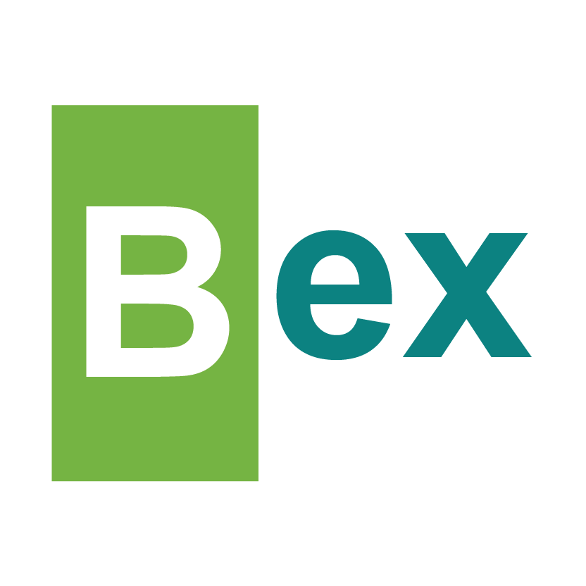
Here is our logo. Simple, yet powerful.
Our logo describes our enterprise confidently.
Our logo describes our enterprise confidently.
Let us elaborate on this.
First, the letter (B) stands for BUSY.
It shows how active we are, always working, never staying ideal. And yes, we take our time off, and when we get busy, we do it with loads of enthusiasm. We build others & we have to build ourselves too. We know that others won't have confidence in us unless we show them what we are made of. This is why we are always BUSY.
It shows how active we are, always working, never staying ideal. And yes, we take our time off, and when we get busy, we do it with loads of enthusiasm. We build others & we have to build ourselves too. We know that others won't have confidence in us unless we show them what we are made of. This is why we are always BUSY.
Secondly, the green background represents growth.
As we get busy going, we can see changes happening around us. These changes are vital for our business and our brand.
As we get busy going, we can see changes happening around us. These changes are vital for our business and our brand.
Thirdly, the (ex) stands for EXPAND.
It shows the fruit of our labors. We desired growth - both for your business and ours. When we consistently drive that culture - expansion is sure.
It shows the fruit of our labors. We desired growth - both for your business and ours. When we consistently drive that culture - expansion is sure.
Finally, the greener (ex) represents development.
We don't want to remain at a point for too long - even when we grow, we want to develop our business too. Change is employed here to make us greener than when we started.
We don't want to remain at a point for too long - even when we grow, we want to develop our business too. Change is employed here to make us greener than when we started.
In summary - We are busy expanding businesses and people. Taking them from green to greener.
Add Busyexpand to your inbox
Get our emails to stay in the know.
Find us
New
121 Obiwali Nkpolu road, Herbert Plaza, Port Harcourt, Rivers State. Nigeria.
Pages
Others
Services

Copyright © 2025 Busyexpand Enterprises. All rights reserved.
Version 3 Build
Welcome to our version 3 build of Busyexpand.com - Our v3 just got released, most information may not be complete, and your experience may also be affected as we fine-tune everything. Asides from all that, everything works just fine.